Professional Painters’ Tips on Matching Paint Colors with Your Tiles
Choosing the right paint color to complement your tiles can elevate your home’s aesthetic and create a harmonious living space. Castle Pines professional painters bring a wealth of experience and insight into this delicate art, and we’re here to share their top tips to help you find the perfect paint colors for your tiles.
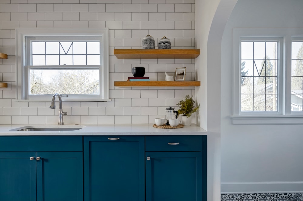
Begin with Tile
Castle Pines professional painters emphasize the importance of starting with the tiles when selecting paint colors. The material, pattern, and color of your tiles serve as the foundation for your entire color palette. Consider the undertones and overall vibe of your tiles to guide your paint color choices.
Tip: Take a close look at the undertones in your tiles – whether warm or cool – and use this as a starting point for selecting complementary paint colors.
Embrace the Color Wheel
Understanding the color wheel is a fundamental skill for professional painters. They recommend using it to identify color relationships and harmonies. For instance, complementary colors (opposites on the color wheel) can create a striking contrast, while analogous colors (next to each other on the wheel) provide a more subtle and cohesive look.
Tip: Experiment with different color schemes from the color wheel to find the combination that resonates with your personal style.
Lighting Matters
Professional painters stress the significance of natural light in color perception. The same paint color can appear vastly different in various lighting conditions. Consider the amount of natural light in your space and test paint samples at different times of the day to ensure your chosen colors look perfect in all lighting scenarios.
The Power of Samples: Test Before You Commit
Before committing to a full paint job, professional painters recommend testing paint samples on your walls. The interaction between your tiles, furniture, and lighting can influence how the paint color appears in your specific environment.
Tip: Purchase small quantities of your top paint color choices, apply them to a discreet section of your wall, and observe the colors in the context of your room.
Transform Your Home with Professional Painters
With these tips from Castle Pines professional painters, you’re well-equipped to embark on your journey to find the perfect paint colors for your tiles. Remember to trust your instincts, have fun experimenting with different color combinations, and enjoy the process of transforming your living space into a work of art. Happy painting!